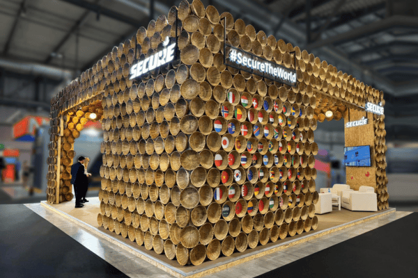

Why Tech Booths Often Fail to Convert
Technology and SaaS companies usually come to exhibitions with strong products, clear use cases, and solid value propositions.
Yet, many booths struggle to convert.
The issue is not the product. It is the gap between what the product does and how it is experienced at the booth.
Unlike physical products, software cannot be understood at a glance. If the booth does not simplify the story quickly, visitors lose interest and move on.
In high-traffic exhibitions, attention is limited. Clarity becomes your biggest advantage.
The Challenge With Intangible Products
Technology products are inherently abstract.
You cannot:
- See the full impact instantly
- Understand functionality without explanation
- Visualize outcomes without context
This makes booth design more complex.
If your space relies only on screens and generic messaging, it becomes difficult for visitors to connect.
The goal is to translate something intangible into something visible, relatable, and easy to grasp.
Lead With the Problem, Not the Product
Most tech booths focus on features.
But visitors care more about outcomes.
Instead of saying what your software does, communicate:
- What problem it solves
- Who it is for
- What changes after using it
For example, instead of listing features, frame your messaging around real business scenarios.
When visitors immediately recognize relevance, they are more likely to engage.
Simplify the First 10 Seconds
Visitors decide quickly whether to stop or move ahead.
Your booth should answer three questions within seconds:
- What is this
- Who is it for
- Why should I care
This can be achieved through:
- Clear headline messaging
- Focused visual cues
- Minimal clutter
Avoid overwhelming the space with too much information.
Clarity attracts. Complexity repels.
Design for Guided Demonstrations
Unlike product-based industries, SaaS requires explanation.
Your booth should be designed to support structured demos.
This includes:
- Dedicated demo stations
- Screens positioned for easy viewing
- Space for small group interactions
The layout should allow your team to guide visitors through the product rather than leaving them to explore it on their own.
A well-conducted demo often becomes the turning point in the conversation.
Balance Digital With Physical Presence
Technology brands often rely heavily on screens.
While digital displays are essential, overdependence can make the booth feel cold and repetitive.
Balance this by:
- Creating physical anchors within the space
- Using design elements that break screen monotony
- Introducing zones for discussion and interaction
The booth should feel like an environment, not just a collection of screens.
Create Clear Visitor Journeys
A strong tech booth guides visitors through a sequence.
For example:
- Entry point with clear messaging
- Demo zone for product understanding
- Discussion area for deeper conversations
This structured flow helps:
- Maintain engagement
- Avoid confusion
- Improve the quality of interactions
Without a defined journey, visitors often drop off after a quick glance.
Use Visual Storytelling to Simplify Complexity
Instead of relying only on verbal explanations, use visuals to support your narrative.
This can include:
- Process flows
- Before and after scenarios
- Use case representations
Visual storytelling reduces the effort required to understand your product.
It also makes your message more memorable.
Design Spaces for Different Conversation Depths
Not every visitor is at the same stage.
Some are exploring, while others are evaluating.
Your booth should accommodate both.
This means creating:
- Open areas for quick interactions
- Semi-private zones for detailed discussions
This separation ensures that serious conversations are not interrupted by high footfall.
Train Your Team to Complement the Design
Even the best-designed booth needs the right people.
Your team should:
- Communicate clearly and concisely
- Adapt based on visitor interest
- Guide conversations towards outcomes
In tech exhibitions, the combination of design and communication determines success.
Avoid Overloading With Information
A common mistake is trying to communicate everything at once.
Long text panels, feature lists, and excessive data can overwhelm visitors.
Instead:
- Focus on key messages
- Use layered communication
- Allow deeper information to come through conversation
This keeps the booth approachable while still being informative.
Final Thoughts
Designing exhibition stalls for technology and SaaS companies is about translating complexity into clarity.
The most effective booths:
- Lead with problems, not features
- Simplify the initial interaction
- Support structured demonstrations
- Create clear visitor journeys
In a space where attention is limited, the brands that succeed are the ones that make understanding effortless.
When visitors quickly grasp what you do and why it matters, conversations become easier and conversions more likely.